
7 TIPS FOR PAINTING SKIN TONES
What does the targeting system of an acoustic torpedo have to with painting skin tones?
Quite a lot actually, and it’s rather straightforward when you see how. Each time you stick some rubber onto a face, there usually follows the task of making that piece of rubber look like it belongs to the rest of the face, to hide itself in plain sight. To accurately reproduce skin colours is a thankless task, as when done correctly it ceases to look like anything has been done.
I still get nervous EVERY time I have to do it because each time is a performance and nothing is guaranteed – there is scope for error.
However, despite that there are a few very simple principles you can cling to that remain regardless of your level of confidence. Lets look at them to help you create your own step-by-step method for making the fake match the face.
There’s three videos in this post so if you are having trouble making your appliances match the skin, then these could help you!
 This was the presentation I did at the 2015 UMAExpo in London this April, so I have reworked it and added some extra things as I think it would be a helpful resource for fellow travellers on the skin-tone matching journey.
I have even put together a free workbook for you to download on this. Click the image to get it now!
The problem
Assuming everything has gone as planned in the manufacture of the appliance, making a prosthetic blend seamlessly into surrounding skin isn’t always easy. Matching the colour involves recreating how the colour is distributed within the skin. It isn’t just one single flat colour.
There is variation in skin colouration from very obvious things like freckles, veins etc. to barely perceptible flecks. Outer forearms tend to catch more sunlight over time than the back, instep or upper arm for example so usually are darker or exhibit sun damage more readily for example.
Unless it is an intentional, heavily made up appliances with thick layers of foundation will look opaque and flat, and appear very ‘masky’ and fake. This is why paint primers for car body work are a flat, matt neutral colour like grey – it will show up the imperfections in a surface allowing you to identify and repair them before the final colour is applied.
With a pre made prosthetic, it is made as a single mass of material which is usually one colour – albeit a (hopefully) good match, but still a single tone over the entire area. The larger the appliance, the greater the area of real skin and variation you will have to recreate.
Typically, extensive prosthetics will be pre painted before application to speed things up in the makeup chair, but unless you know what colours to put where, it isn’t much use. Here are a few tips and tricks you can do to help oil the wheels of success and damp the flames of frustration.
Three Pillars
When painting any appliances, it helps to consider the three main factors involved, and they all have a bearing on how the paint job will go. To make this sound more important, I have chosen to call them pillars.
1. Skin colour
For the sake of argument, we are trying to make the appliance look like it is the same colouring as the person’s real skin. If you want to smother someone in solid green, that’s going to be easier than recreating their natural skin tone.
2. Appliance base colour
This would ideally be a good colour that matches the person. This is not guaranteed. Sometimes you may have a piece which isn’t the right colour and you will have to correct it to make it match. This may be because the person who mixed up the silicone base made a mistake, or the performer has gotten a tan since the pieces were made. Damn you, lazy days on the beach!
3. Makeup
The products you use and the manner in which you apply them is of course the critical step in you being able to bridge any gaps between the first two factors. I mean pillars.
Tip 1 – Be familiar with the face before you start slapping anything on it.
 Get to learn what colours are in the face and where they are. It helps to start with a picture of the person beforehand. Have a good clear image of their face in good light and study what colours they have and where. Almost meditate to it, get really aware of their colouring.
It takes a while, kind of like being outside in bright sunlight and stepping through into a dark and gloomy room, your eyes need to physically adjust to permit the reduced amount of light in. So it is with colour – often when you start you just see ‘skin’. After a while you can start to see subtle variations on pigment, and then they gradually become more obvious.
If you are matching the skin tone of the person, at least to begin with, it helps to have a clear image of what you are about to cover up. If you can make the piece of rubber you stick on look like the skin underneath it, then any kind of character makeup you do over the top of this will be happening over a realistic looking face.
Tip 2 – If the colour is wrong, it probably only needs a touch of one of three colours to get better.
It essentially boils down to the three primary colours. It needs to be bluer, redder or yellower – or a combination of those colours.
 Your average desktop printer can shoot out colour photos using just those colours and black. I’m not suggesting you go back to basic and only carry primary colours – we have makeup which is formulated to better approximate a variety of skin tones. But it helps you so much to focus of the rough direction it needs to go, and choose the appropriate colour accordingly.
This is when really analysing the persons skin colour in advance pays off. If you have figured they are ruddy, olive toned or tend to redden easily then you can quite confidently select the appropriate shade for around the nose, under eyes etc. and pack in those variations quicker.
Tip 3 – Use Photoshop to Reveal Where those colours are hiding.
There are a couple of tools in Photoshop which are great for simplifying to colours on a face, and allow you to focus your search if looking at a photograph of a face doesn’t seems to reveal much to you at first.

Posterize for posterity.
One is Posterize (Image>Adjustments>Posterize). If you are not familiar with the term, it basically means taking the millions of available colours in an image and reducing them into fewer groups so a simplified version of the image is created.
It was used for creating cheap posters, where the colour printing process was not especially sophisticated and so colour images would be rendered in three or four colours, like this:
How does this help? Well, in Photoshop, you can choose the level of simplification to recreate the image from level2 to level 255.
Doing so will reveal in a much simplified way where the significant dark and light areas are located – usually around the base of the nostrils, mouth corners, under eyes and above the lids etc. Not so much pushing boundaries as actually locating them.
Check out the video below to see posterize in action!
Tip 4 – The Channels Window
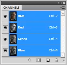 Aha! The Channels window (Window>Channels). An image on any screen – no matter how detailed or complex it may appear is basically made up of red, green and blue light and is therefore known therefore known as an ‘RGB’ mode image.
You can actually toggle off any of those individual colours in Photoshop which is a great way to reveal where abouts in the image they are.
Photoshop is able to be display images in a number of modes, so switch the mode to CMYK (Cyan, Magenta, Yellow and Key black) by clicking on Image>Mode>CMYK. This is the mode which is used for images intended to be printed.
Looking at an image of a face, by dropping all but the red channel, you get a better idea of where the reds are situated. It basically gives you an exaggerated map of where those colours reside in that image. That can help you understand where the colours are distributed about the face. Use that information to inform where you will need to add more of those tones in your makeup.
Check out the video on the channels window below!
Tip 5 – Use Photoshop to put numbers on those colours.
I did a blog post on this a while ago, and it is still a handy trick to help quantify the rather abstract notion of colour. By using the colour-picker tool, you can choose an area or even an individual pixel and see what percentage of that colour is Cyan, Magenta, Yellow and black.
This is really handy for identifying amounts of red/yellow/blue in any given area. Often the numbers are surprising and it’s quite an education to see precisely what goes into making up a skin tone.
Check out this example of an image I took from a workshop I did recently. You can see the skin colour of the arm, and the appliance colour. It is clear there is a difference between the appliance and the skin, but specifically what is that difference and how do you make up the deficit of colour to correct it?
Using the colour picker tool, you can see quite clearly that the skin has a lot more cyan, magenta and yellow, as well as black to darken. By actually having numbers on there, you can locate roughly the amounts needed to add to get much closer to a match.
Check out the video below to see what I mean!
Tip 6 – Think like a torpedo.
Think like a what now? Well, a sea-launched torpedo has an interesting way of finding its target. It usually has a sonar system which ‘pings’ out a sound wave and listens to the returning echo to decide where the target is.
Given that boat, the submarine and the torpedo are constantly moving in water, it needs to constantly ping out a sound, listen to where the strongest echo is coming from and then change course accordingly, constantly modifying.
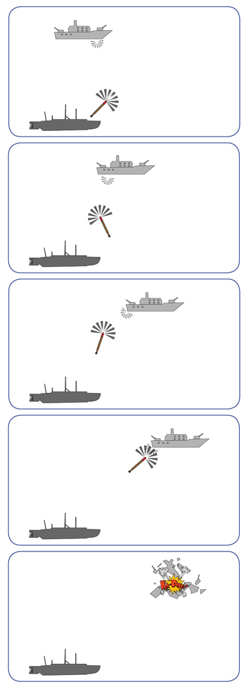 When it is first launches, it is far away and naturally the biggest changes in direction take place, and it steers left or right to align with the centre of the target as best it can.
As it gets closer, the adjustments of left to right become smaller and smaller until it finally is travelling straight and BOOM, it it’s the target.
That is kind of how I approach painting appliances. Once the piece is on and all gluing is finished, I start out with an honest judgement as to what is missing on the piece – what exactly does the skin have that the piece does not? It’s about spotting what’s missing first before adding. Is the skin darker? Redder? Yellower? Greener?
Usually start with red or pink. Absence of red is common with pieces because the blood under the skin is showing through in some places more than others. Sides of nose, cheeks, lips etc usually will have more red. It may be vague misting or it could be quite defined as with capillaries and veins etc. You usually need some red to make it look real.
Choose the right red, cooler or warmer. Warmer usually has more yellow in it, and for people with warmer skin tones then a warmer red is better.
For some people who are paler, pinky reds are better. I use the Rose Adjuster a lot for this in the standard Skin Illustrator palette.
Once you think there is enough red, you can go in with yellow, or a yellowy brown if you think it needs to be yellower and darker. The Cedar Brown is nice, and Midnight Brown is excellent at muting and darkening too.
Each of these colours is making a smaller and smaller amount of adjustment – the first choices as to whether it needs to be darker/redder etc. are bold and the most drastic. As each layer of colour is laid down, they become more subtle and less obvious. Each colour makes a tiny tweak and nudges the piece ever closer to correct. When the difference between the skin and the piece is not noticeable, then you’ve hit your target!
Tip 7 – Failure
Painting skin tones, especially on appliances that you have made yourself from start to finish means it can carry so much weight in your head. It feels like a lot is riding on it, you’ve invested so much time and along the way all the processes that could have gone wrong didn’t so the final piece feels like a precious and unique jewel.
That can make anything less than perfection feel like a crushing failure. If that is not you, then congratulations, you are a rare and lucky individual. If it is you, then you have to acknowledge that feeling of disappointment. Feel it, swim in it then step out and look afresh at it objectively. What, precisely, is wrong? Is it too dark/yellow/muddy/messy/pale/clean.
Identify the problem in a broad way, then tentatively nudge it towards what is missing. The issue is a colour issue, – not a ‘you’ issue. That way it isn’t failure any more.
I study in fine arts and this is one of the most usefull and well explained “class” I ever had. Thank you a million times for sharing your knowledge. You made my day.
Thanks a lot for this!!! I’m so happy to have found this page and it’s worth checking.
I’m really interested in colour theory. As a funeral director one of my hardest jobs is to make people look ‘asleep’. Can you point me anywhere where I can find out more about applying make up as opposed to silicone pieces. Trying to hide bruises and discolouration is my main problem.
NecroMetics.com specializes in cosmetics and techniques for this. Check their website at http://www.necrometics.com
excellent colour tips stuart! i’ve a small yet important piece to colour match tomorrow on an actress. i’ve only seen her arm in a blurry picture. she’s fairly tanned and the piece is standard flesh tone. Hoping i pull it out the bag!!
Pingback: Colour Theory In Practice |