One of the most common difficulties faced by those of us who foolishly stick bits of rubber onto faces for fun is matching a persons skin tone realistically.
Whether you are mixing up a colour to paint a big rubber body to look real, blend in an appliance or mixing up a flesh pigment for silicone, making a skin colour up out of primary colours is a tricky thing to master. I wanted to share something I have used to help me solve the puzzle.
I remember watching The Lost Boys (loved that movie), and seeing Greg Cannoms’ awesome vampire make-ups (using the now commonplace ‘vampire brow’ look) and trying it out on myself, failing miserably to get the colour right. (I got there eventually, but I had not figured out how to get great edges…check out the article I wrote with some of my early attempts).
There were a couple of things that I did not know then but do now which where responsible for this utter failing.
1. Skin is translucent, not opaque like the makeup I was applying.
2. Skin is not a single colour, but a gentle mottle of many colours to a lesser or greater degree.
(3. I was utterly crap at it too, although somehow this did not stop me from continually trying.)
So, when I started using Photoshop, it was a great to find tools which can be used to help take some of the guesswork out of mixing skin tones. If you have Photoshop – great, you can try this out for yourself. If not, you can use the examples I have shown below anyway to help your mixing.
Sure, I can tell you to mix up varying quantities of red, yellow and blue with some white (after all, your computer printer does a great job of making skin tones from photos just using just four colours) but how much of what? You are usually mixing tiny amounts and and can’t easily weight a tiny blob of paint with any accuracy.
Obviously, there are lots of paint and pigment colours depending on the actual medium you are using, but I am concentrating on just using five of them – Cyan, Magenta, Yellow, Black and White. Any extra colours you can find will speed things up, but are not necessary.
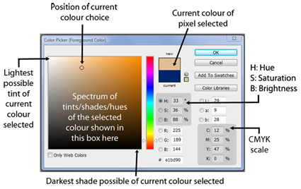
The ‘Color Picker’ tool in Adobe Photoshop (pictured below) appears as a box and basically allows you to select a single pixel within an image and gives a lot of data about that particular colour.
 It breaks down the chosen colour using a few different colour scales such as RGB (Red, Green, Blue for monitors etc and ‘#’ which is for web colours). However, we are interested in physical pigments and so we look at the numbers used in the CMYK scale – Cyan, Magenta, Yellow, Key Black. Using my knobbly visage as a starting point, lets have a look at how it works.
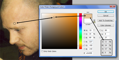
You can see that the colour I have selected just above my eyebrow has appeared within the colour picker near the top of the range in that square. It also is shown as a colour swatch in that little rectangle to the right. Following the arrows, you can see it happens to be made up of the following amounts:
Cyan: 11
Magenta: 24
Yellow, 47
Black: 0
So what does this have to do with painting?
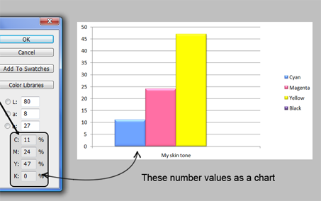
Well basically, it spells out the proportions of the different colours used with white in order to create that colour. If I put these number values through Microsoft Word chart maker (pictured below), I can create a simple bar chart which represents more visually how much of each colour is needed in order to mix that particular skin tone.
 Because the proportions of each colour are shown, you can use this guide to mix any quantity of this base colour. Here, there is twice as much magenta as cyan, and twice the amount of yellow as magenta, and no black.
These colours mixed together and added to white should get pretty close to the chosen skin tone so long as you use good quality pigments of the same brand and type. It won’t be exact but it will certainly take a lot of the guesswork out. Always add this mixed colour to the white, and not the other way around or else you may end up using gallons of white before you arrive at the correct brightness.
Check out the other examples below and compare the colour proportions used.
 What is quite interesting in the images above and below is how similar the chart appears despite clear skin colour differences. The above colour picked is deliberately a mid range colour from the available shadow and highlights on her face. Below I have chosen a darker area under the eyes of person with paler skin.
It is important to therefore select an area that fairly represents the skin tone, or take a sample from the highlight and a sample from the shadow in order to determine what a mid-range colour is. Usually, it is a good idea to mix a skin tone which is slightly paler than required so that it can be shaded with paint or makeup in those required areas. This way you won’t need to add highlights, as the pale base is the highlight
Got a colour mixing issue?
If you have any questions, comments or if you are having trouble mixing or matching a colour, feel free to email me an image or leave a comment and I will do the above breakdown for you and try and help you out.
-Stuart


Awesome, never occurred to me to do that in PS? Oh and Todd, love your book but only thing is… it gets really worn when I bring it with me in my bag on locations, sets, those long road trips, the bathroom – you know it looks like I’ve had it for a century. Might need to get a shiny brand new one again? When is the latest edition coming? You guys are super, keep it all up. Thanks.
Pingback: Colour theory In Practice |
Pingback: 7 Tips For Painting Skin Tones |
My wife and I are making a fake nose out of silicone for the Opera “Cyrano”. We have gone through a lot of books and videos, but we are trying to understand the difference between using the flocking and the silicone pigments. Thanks for your help.
Hi Chris
I am going to put together a post to answer this fully, but will email you asap.
-Stuart
Stuey, you’re a genius! I’ve found myself mixing up lots of base colours for large batches of silicone over the last couple of years -and it never seems to get any easier. Especially when you have to match it to an actors skin tone… It can be quite a stressful job, what with the cost of silicone. I also use photoshop alot and am always messing around with the colour pallette – but have never thought to use the computer to help with the physical elements of making FX. 🙂 This is a bloomin good idea that I will be putting in to practice in the near future! Thanks a lot!!
Ben.
Hey Ben
Is that you, they guy from Frostbite..? he he
Sorry for the delay. I’m glad you dig it…I have loads of ideas like that and I will write them as soon as I can. This year is BUSY I am pleased to say. The FX workshops are humming (I mean they are busy, not that they smell..although…) but I love writing the blog.
It’s just that it takes me about two weeks to put an entry together (I am fussy) but I have a sheet of ideas and plans that I am itching to get at!
-Stuart-